Using data display with PlotData
1. Introduction
PlotData is a Python web library that allows to draw data with several kinds of layouts such as scatters, histograms, graphs,…
This tutorial teaches how to use it for working with Dessia framework, to draw insightful figures to take well informed decisions.
In this tutorial, all available features are explained and presented in simple examples, exhibited both on standalone mode and in Dessia Platform context:
- If the reader is interested in how to use PlotData in Python IDE, please refer to 2 - Draw data with PlotData.
- If the reader is interested in how to post treat workflow results in Dessia platform, please refer to 3 - PlotData on Dessia’s Platform.
2 - Draw data with PlotData
Create a new file with a Python IDE.
2.1 - Graph2D: draw curves on a Figure
With Graph2D, time series or any curve function that can be written y = f(x) can be displayed on a figure with axes such as x values are drawn on x axis and y values are drawn on y axis, in an orthogonal frame.
2.1.1 - How to draw a curve in a Graph2D ?
- Import the required packages
# Required packages
import math
import plot_data.core as pld
from plot_data.colors import BLUE, DARK_BLUE, RED, BLACK- Create Data
In order to display a Graph2D, create a vector of x values and their associated y values.
Values then have to be added in a list of samples, where each sample is a dict which keys are names of samples’ features.
Here, we create a sinusoidal function.
# Inputs
amplitude = 2
n_samples = 50
x_name = "angle"
y_name = "amplitude"

# Vectors creation
X = [i / (2 * math.pi) for i in range(n_samples)]
Y = [amplitude * math.sin(i) for i in X]

# Build PlotData vector of samples
samples = []
for k in range(len(X)):
    samples.append({x_name: X[k], y_name: Y[k]})

# Create the dataset
dataset = pld.Dataset(elements=samples, name='y = A.sin(x)',)- Add meta-data on samples
Some additional information can be added on data thanks to tooltips, that can be displayed by clicking on the shape that carries the designed tootlip.
Here, the tooltip is directly created as an independent object that will be used in next steps, while creating the figure to draw the previously built data.
# Attributes to show in tooltip
shown_attributes = [x_name, y_name]

# Tooltip creation
tooltip = pld.Tooltip(attributes=shown_attributes)- Set styles for points, curves and axes
Styles for points, curves and axes can be customized with the user’s preferences.
# Points style
point_style = pld.PointStyle(color_fill=RED, color_stroke=BLACK)

# Curves style
edge_style = pld.EdgeStyle(color_stroke=BLUE, dashline=[10, 5])

# Dataset style
custom_dataset = pld.Dataset(
	elements=samples,
	name='y = A.sin(x)',
	tooltip=tooltip,
	point_style=point_style,
	edge_style=edge_style
	)

# Axis style
## Text style
graduation_style = pld.TextStyle(
	font_size=10,
	font_style='Arial'
	)

## Axis edge style
axis_style = pld.EdgeStyle(
	line_width=0.5,
	color_stroke=DARK_BLUE,
	dashline=[]
	)

# Axes ticks number and styles
axis = pld.Axis(
	nb_points_x=7,
	nb_points_y=5,
	graduation_style=graduation_style,
	axis_style=axis_style
)- Create the Graph2D object and draw it in a web browser
graph2d = pld.Graph2D(
	graphs=[custom_dataset],
	x_variable=x_name,
	y_variable=y_name,
	axis=axis
	)
Once done, the figure can be displayed with the following command line :
pld.plot_canvas(plot_data_object=graph2d, canvas_id='my_graph2d')2.1.2 - Graph2D features
- Points used to build the curve can be displayed by clicking on
Show Pointsbutton, - The figure can be scaled with mouse wheel or by clicking on
Zoom Box,Zoom+andZoom-buttons, - Curves can be displayed with log scales by clicking on
Log Scalebutton, - One can select points with a selection window by keeping pressed the
Shiftkey, - One can select several points with several mouse click by keeping pressed
Ctrlkey, - One can reset the view by pressing
Ctrl + Space, - One can reset the whole figure by pressing
Ctrl + Shift + Left Click.
2.1.3 - How to add a method to draw a Graph2D within a DessiaObject ?
A Graph2D (or any kind of figure that can be drawn with PlotData) can be added to any DessiaObject to depict its behavior.
In the following example, a free pendulum with no friction as been designed as a DessiaObject.
Firstly, import all the required packages.
import math
import numpy as npy

from dessia_common.core import DessiaObject
from dessia_common.decorators import plot_data_view

import plot_data.core as pld
from plot_data.colors import Color
Then create a pendulum object with no friction. Required attributes to get the pendulum movement are its initial angle, its length, its mass and the gravity acceleration constant (declared as a variable g). duration and time_step have been added to simulate the pendulum over time.
In order to get the pendulum state evolving with time, a method to compute its angle over time and a method to compute its Cartesian coordinates (coords) over time have also been added.
class Pendulum(DessiaObject):
    _standalone_in_db = True

    def __init__(self, init_angle: float, length: float, g: float,
							   duration: float, time_step: float, name: str = ''):
        self.length = length
        self.g = g
        self.duration = duration
        self.time_step = time_step
        self.init_angle = init_angle
        self.period = self._compute_period(length)
        self.time = self._get_time_vector(duration, time_step)
        self.angle = self._compute_angle()
        self.coords = self._compute_coords()
        super().__init__(name)

    def _compute_period(self, length: float):
        return (self.g / length) ** 0.5

    def _get_time_vector(self, duration: float, time_step: float):
        return npy.arange(0, duration + time_step, time_step).tolist()

    def _compute_angle(self):
        return [self.init_angle * math.cos(self.period * t) for t in self.time]

    def _compute_coords(self):
        return [
	        [self.length * math.sin(angle), self.length * (1 - math.cos(angle))]
	        for angle in self.angle
	        ]
To plot the pendulum state variables over time, write methods with @plot_data_view decorator for platform usages. Each of the written method defines a Graph2D to draw data of interest.
# To add to Pendulum class
@plot_data_view("angle_vs_time")
def angle_vs_time(self, reference_path: str = "#"):
    elements = [
      {"time": t, "angle": angle}
      for t, angle in zip(self.time, self.angle)
      ]
    dataset = pld.Dataset(elements, name="angle vs time")
    graphs2d = pld.Graph2D(
      graphs=[dataset],
      x_variable="time",
      y_variable="angle"
      )
    return graphs2d

@plot_data_view("x_vs_time")
def x_vs_time(self, reference_path: str = "#"):
    elements = [
      {"time": t, "x": coord[0]}
      for t, coord in zip(self.time, self.coords)
      ]
    dataset = pld.Dataset(elements, name="x vs time")
    graphs2d = pld.Graph2D(
      graphs=[dataset],
       x_variable="time",
       y_variable="x"
       )
    return graphs2d

@plot_data_view("y_vs_time")
def y_vs_time(self, reference_path: str = "#"):
    elements = [
      {"time": t, "y": coord[1]}
      for t, coord in zip(self.time, self.coords)
      ]
    dataset = pld.Dataset(elements, name="y vs time")
    graphs2d = pld.Graph2D(
      graphs=[dataset],
      x_variable="time",
      y_variable="y"
      )
    return graphs2d

@plot_data_view("y_vs_time")
def y_vs_x(self, reference_path: str = "#"):
    elements = [{"x": x, "y": y} for x, y in self.coords]
    dataset = pld.Dataset(elements, name="y vs x")
    graphs2d = pld.Graph2D(graphs=[dataset], x_variable="x", y_variable="y")
    return graphs2d
In these methods, a vector of elements is firstly created and added to a Dataset. It is then declared as the only dataset drawn in a Graph2D object that plots x_variable against y_variable of vector elements.
The results of graph drawings are available on the next 4 html pages in the present document. They have generated with the following code:
# Instantiate a pendulum
pendulum = Pendulum(math.pi / 3, 1, 9.81, 10, 0.01)

# Draw its graphs with specific files name
pld.plot_canvas(plot_data_object=pendulum.angle_vs_time(), canvas_id='my_graph2d', filepath="section2_1_2_angle_time")
pld.plot_canvas(plot_data_object=pendulum.x_vs_time(), canvas_id='my_graph2d', filepath="section2_1_2_x_time")
pld.plot_canvas(plot_data_object=pendulum.y_vs_time(), canvas_id='my_graph2d', filepath="section2_1_2_y_time")
pld.plot_canvas(plot_data_object=pendulum.y_vs_x(), canvas_id='my_graph2d', filepath="section2_1_2_x_y")
2.2 - Display several curves in a Graph2D object
Graph2D objects also allows to draw several curves on only one figure.
2.2.1 - How to create a Graph2D with several curves ?
Several datasets can be used to create a Graph2D. This allows to draw several curves on only one figure. The following code lines show how to specify it to draw x and y values of a circle with radius = 1.
import numpy

import plot_data.core as pld
from plot_data.colors import BLUE, RED

time = npy.arange(100)
x_coord = npy.cos(0.1 * time)
y_coord = npy.sin(0.1 * time)
x_vector = []
y_vector = []
for t, x, y in zip(time, x_coord, y_coord):
	x_vector.append({"time": t, "amplitude": x})
	y_vector.append({"time": t, "amplitude": y})

x_dataset = pld.Dataset(elements=x_vector, edge_style=pld.EdgeStyle(color_stroke=BLUE))
y_dataset = pld.Dataset(elements=y_vector, edge_style=pld.EdgeStyle(color_stroke=RED))
graph2d = pld.Graph2D(graphs=[x_dataset, y_dataset], x_variable="time", y_variable="amplitude",)
pld.plot_canvas(plot_data_object=graph2d, filepath="section2_2_1_alone_multi_graph")
In the case of the pendulum, one can draw both x and y on the same Graph2D.
In order to do it, a function that takes a pendulum as argument and draws a Graph2D with both the curves on the same plot can be written.
# Function definition
def pendulum_draw_x_y_vs_time(pendulum):
    x_amplitude = []
    y_amplitude = []
    # Create vector elements with same name for x and y values
    for t, coord in zip(pendulum.time, pendulum.coords):
        x_amplitude.append({"time": t, "amplitude": coord[0]})
        y_amplitude.append({"time": t, "amplitude": coord[1]})

    # Create the two datasets
    x_dataset = pld.Dataset(
	    elements=x_amplitude,
	    name="x_amplitude",
	    edge_style=pld.EdgeStyle(color_stroke=Color(1, 0, 0))
	    )
    y_dataset = pld.Dataset(
	    elements=y_amplitude,
	    name="y_amplitude",
	    edge_style=pld.EdgeStyle(color_stroke=Color(0, 0, 1))
	    )

	  # Draw the Graph2D
    graphs2d = pld.Graph2D(
	    graphs=[x_dataset, y_dataset],
	    x_variable="time",
	    y_variable="amplitude"
	    )
    pld.plot_canvas(plot_data_object=graphs2d, canvas_id='my_graph2d')

# Instantiate a pendulum
pendulum = Pendulum(math.pi / 3, 1, 9.81, 10, 0.01)

# Draw Graph2D
pendulum_draw_x_y_vs_time(pendulum)
2.2.2 - How to design a class for getting a Graph2D with several curves ?
For the pendulum example, a Design Of Experiment (DOE) can be built to generate several pendulums with different masses, lengths, initial angles or even on different planets.
Firstly, Dataset to store all generated pendulums have been designed. Then the from_boundaries method has been written to generate sets of pendulum thanks to a sampling. It has been set to produce several solutions in a closed parameter space which is, in this example, constituted of the planet’s gravity g and the pendulum’s length.
import math
from matplotlib import colormaps
import numpy as npy
from typing import List

from dessia_common.core import DessiaObject
from dessia_common.optimization import BoundedAttributeValue, FixedAttributeValue
from dessia_common.datatools.dataset import Dataset
from dessia_common.datatools.sampling import ClassSampler
from dessia_common.decorators import plot_data_view

import plot_data.core as pld
from plot_data.colors import Color, DARK_BLUE, BLUE

class PendulumDOE(Dataset):
    def __init__(self, dessia_objects: List[DessiaObject] = None, name: str = ''):
        super().__init__(dessia_objects=dessia_objects, name=name)

    @classmethod
    def from_boundaries(cls, planet_sampling: BoundedAttributeValue,
										    length_sampling: BoundedAttributeValue,
                        duration: float, time_step: float, method: str = 'lhs',
                        n_samples: int = 1000, name: str = ''):
        sampled_attributes = [planet_sampling, length_sampling]
        fixed_attributes = [
            FixedAttributeValue("init_angle", math.pi / 3),
            FixedAttributeValue("duration", 10),
            FixedAttributeValue("time_step", 0.05)
            ]
        sampler = ClassSampler(Pendulum, sampled_attributes, fixed_attributes)
        return cls(sampler.make_doe(n_samples, method).dessia_objects, name=name)
Finally, to draw all curves in a unique Graph2D figure, write specific methods for creating a curve for each pendulum. Here the code is duplicated for the sake of simplicity but every duplicated line should be in a factored method (e.g. colors, for loop,…). Some colors have been added for a better viewing and curves’ name have been set so that the corresponding pendulum’s parameters are shown when clicking on its curve.
# To add to PendulumDOE class
@plot_data_view("all_y")
def all_y_vs_time(self, reference_path: str = "#"):
    datasets = []
    cmap = colormaps["jet"](npy.linspace(0, 1, len(self.dessia_objects)))
    for i, pendulum in enumerate(self.dessia_objects):
        color = Color(*cmap[i][:-1])
        edge_style = pld.EdgeStyle(line_width = 0.8, color_stroke=color)
        elements = [{"time": time, "y": coord[0]} for time, coord in zip(pendulum.time, pendulum.coords)]
        name = f"length: {round(pendulum.length, 2)}, planet: {round(pendulum.g, 2)}"
        dataset = pld.Dataset(elements, name=name, edge_style=edge_style)
        datasets.append(dataset)

    graphs2d = pld.Graph2D(graphs=datasets, x_variable="time", y_variable="y")
    return graphs2d

@plot_data_view("all_x_y")
def all_y_vs_x(self, reference_path: str = "#"):
    datasets = []
    cmap = colormaps["jet"](npy.linspace(0, 1, len(self.dessia_objects)))
    for i, pendulum in enumerate(self.dessia_objects):
        color = Color(*cmap[i][:-1])
        edge_style = pld.EdgeStyle(line_width = 0.8, color_stroke=color)
        elements = [{"x": x, "y": y} for x, y in pendulum.coords]
        name = f"length: {round(pendulum.length, 2)}, planet: {round(pendulum.g, 2)}"
        dataset = pld.Dataset(elements, name=name, edge_style=edge_style)
        datasets.append(dataset)

    graphs2d = pld.Graph2D(graphs=datasets, x_variable="x", y_variable="y")
    return graphs2d
Once done, the DOE can be generated and the pendulum behavior curves can be displayed with the following command lines:
# Parameters sampling definition
planet_sampling = BoundedAttributeValue('g', 1, 11, 10)
length_sampling = BoundedAttributeValue('length', 0.1, 3, 10)

# DOE instantiation
pendulum_doe = PendulumDOE.from_boundaries(
	planet_sampling,
	length_sampling,
	10,
	0.01,
	method = 'fullfact'
	)

# Graph2D creation
y_vs_t_curves = pendulum_doe.all_y_vs_time()
y_vs_x_curves = pendulum_doe.all_y_vs_x()

# Plot
pld.plot_canvas(plot_data_object=y_vs_t_curves, canvas_id='my_graph2d')
pld.plot_canvas(plot_data_object=y_vs_x_curves, canvas_id='my_graph2d')
2.3 - Scatter: draw points on a Figure
A Scatter draw is a figure that plots points in an orthogonal frame, without any curve to link them. As an example a transparent curve from the previous Graph2D where points are shown is like a Scatter drawing.
2.3.1 - How to draw a Scatter ?
- Import the required packages
# Required packages
import random
import plot_data.core as pld
from plot_data.colors import BLUE, RED, GREEN, BLACK- Create Data
In order to draw a Scatter plot with random values, build a random vector of samples (stored as Python dict) with different attributes. Here three attributes (mass, length and speed) have been set for the samples to carry more information than just their coordinates in the Scatter plot:
# Vector construction
elements = []
for i in range(500):
    elements.append({'mass': random.uniform(0, 10),
                     'length': random.uniform(0, 100),
'speed': random.uniform(0, 3.6)})- Add meta-data on samples
Some additional information can be added on points thanks to tooltips. They can be displayed by clicking on the point of interest. Here, the tooltip is directly created as an independent object that will be used in next steps, while creating the figure to draw the previously built data.
For the scatter example, some point sets are defined (PointFamily object, where a sample is in a set if this set contains its index in vector elements).
# Attributes to show in tooltip
shown_attributes = ["mass", "length", "speed"]

# Tooltip creation
tooltip = pld.Tooltip(attributes=shown_attributes)

# Points sets declaration
points_sets = [
    pld.PointFamily(RED, [0, 1, 2, 3, 4, 5, 6, 7, 8, 9]),
    pld.PointFamily(BLUE, [10, 11, 12, 13, 14, 15, 16, 17, 18, 19])
]- Set styles for points, curves and axes
Styles for points and axes can be customized with the user’s preferences.
# Points style
point_style = pld.PointStyle(color_fill=GREEN,
                             color_stroke=BLUE,
                             stroke_width=2,
                             size=8,
                             shape='square')
# Axis style
## Text style
graduation_style = pld.TextStyle(
	text_color=BLUE,
	font_size=10,
	font_style='Arial'
	)

## Axis edge style
axis_style = pld.EdgeStyle(
	line_width=0.5,
	color_stroke=DARK_BLUE,
	dashline=[]
	)

# Axes ticks number and styles
axis = pld.Axis(
	nb_points_x=7, nb_points_y=5,
	graduation_style=graduation_style,
	axis_style=axis_style
)- Build the Scatter object and draw it in a web browser
scatter = pld.Scatter(
    elements=elements,
    x_variable="mass",
    y_variable="length",
    point_style=point_style,
    points_sets=points_sets,
    axis=axis,
    tooltip=tooltip
    )
Once done, the figure can be displayed with the following command line :
pld.plot_canvas(plot_data_object=scatter, canvas_id='my_scatter')2.3.2 - Scatter features
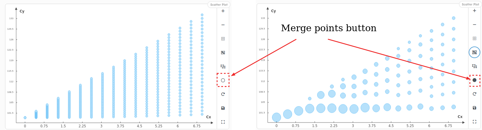
- Points used to build the curve can be merged by clicking on
Merge Pointsbutton, - The figure can be scaled with mouse wheel or by clicking on
Zoom Box,Zoom+andZoom-buttons, - Points can be displayed in log scales by clicking on
Log Scalebutton, - One can select points with a selection window by keeping pressed the
Shiftkey, - One can select several points with several mouse click by keeping pressed
Ctrlkey, - One can reset the view by pressing
Ctrl + Space, - One can reset the whole figure by pressing
Ctrl + Shift + Left Click.
2.3.3 - How to write a function to draw a Scatter for an object ?
As a concrete example, the influence of the pendulum’s period on its maximum speed can be studied by drawing a scatter plot of the pendulum’s maximum speed against its period.
- First, add methods to pendulum to compute some insightful values to draw on a scatter plot. Here, we compute the speed over time and its maximum value.
# To add to the pendulum class
def get_speed(self):
    speed = npy.array(self.coords)[1:, :] - npy.array(self.coords)[:-1, :]
    return npy.linalg.norm(speed, ord=2, axis=1) / self.time_step

@property
def max_speed(self):
return npy.max(self.get_speed())- Then write a function to draw speed against period in a Scatter plot
In the following code lines, point_style , axis_style and axis properties are customized and tooltip is specified so that only relevant information are drawn in tooltips when points are clicked.
def scatter_speed_period(pendulum_doe: PendulumDOE, reference_path: str = "#"):
    tooltip = pld.Tooltip(["length", "g"])
    elements = [
	    {"period": pendulum.period,
	     "speed": pendulum.max_speed,
	     "length": pendulum.length,
	     "g": pendulum.g} for pendulum in pendulum_doe.dessia_objects]

    # Point Style
    point_style = pld.PointStyle(
      color_fill=Color(0, 1, 1),
      color_stroke=Color(0, 0, 0),
      size=6,
      shape="triangle", # square, circle, mark, cross, halfline
      orientation="down" # up, left, right
      )

    # Axis edge style
    axis_style = pld.EdgeStyle(
     	line_width=0.5,
     	color_stroke=DARK_BLUE,
     	dashline=[]
     	)
    axis = pld.Axis(
     	nb_points_x=10, nb_points_y=15,
     	axis_style=axis_style
     	)
    return pld.Scatter(x_variable="period", y_variable="speed",
										   elements=elements, tooltip=tooltip,
point_style=point_style, axis=axis)- Run the function to draw the Scatter plot in a web browser
With such plot the user can pick the best solutions considering its performances criteria.
scatter = scatter_speed_period(pendulum_doe)
pld.plot_canvas(plot_data_object=scatter, filepath="section_2_3_speed_period")
2.3.4 - How to add a method to draw a Scatter within a DessiaObject ?
For the pendulum example, the previous Scatter plot can be added to the PendulumDOE class by simply changing the previous function into a PendulumDOE method. As for Graph2D, a decorator @plot_data_view is added for a future platform usage. Furthermore, for the sake of simplicity, plot customization is removed:
# To add to PendulumDOE class
@plot_data_view("max_speed")
def scatter_speed_period(self, reference_path: str = "#"):
    tooltip = pld.Tooltip(["length", "g"])
    elements = [
        {"period": pendulum.period, "speed": pendulum.max_speed, "length": pendulum.length, "g": pendulum.g}
        for pendulum in self.dessia_objects]
    return pld.Scatter(x_variable="period", y_variable="speed", elements=elements, tooltip=tooltip)
To draw this scatter in a web browser, run the following code lines:
scatter_self = pendulum_doe.scatter_speed_period()
pld.plot_canvas(plot_data_object=scatter_self, canvas_id='my_scatter')
2.4 - Parallel Plot: draw all features on one Figure
Parallel plot or parallel coordinates plot allows to compare features of several individual observations (series) on a set of numeric variables.
Each vertical bar represents a variable or an objective value and has its own scale (units can even be different). Values are then plotted as series of lines connected across each axis.
Thanks to Parallel Plot, correlations between variables and objectives can be globally visually studied.
2.4.1 - How to draw a Parallel Plot ?
- Import the required packages
# Required packages
import random
import plot_data.core as pld
from plot_data.colors import BLUE, RED, GREEN, BLACK- Create Data
In order to draw a Parallel plot with random values, build a random vector of samples (stored as Python dict) with different attributes. Here 3 float attributes (mass, length and speed), 1 integer attribute (rank) and 1 discrete attribute (shape) are chosen to describe each sample.
# Vector construction
elements = []
SHAPES = ['round', 'square', 'triangle', 'ellipse']
for i in range(500):
    elements.append({"mass": random.uniform(0, 10),
                     "length": random.uniform(0, 100),
                     "speed": random.uniform(0, 3.6),
                     "shape": random.choice(SHAPES),
"rank": random.randint(1, 20)})- Build the Parallel Plot object and draw it in a web browser
parallel_plot = pld.ParallelPlot(
    elements=elements,
    axes=["mass", "length", "speed", "shape", "rank"],
    edge_style=edge_style
    )
Once done, the figure can be displayed with the following command line :
pld.plot_canvas(plot_data_object=parallel_plot, canvas_id='my_parallel_plot')2.4.2 - Parallel Plot Features
- Rubberbands can be drawn on axes by clicking and dragging on it with mouse. Rubberbands allow to select range of values on each axis,
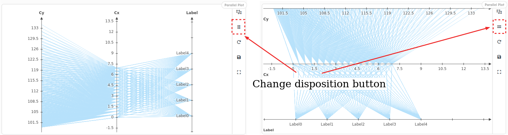
- Axes layout can be changed from vertical to horizontal with the
Change Dispositionbutton, - Values order on axes can be changed from ascending to descending by clicking on its title,
- Each axis can be scrolled and scaled with mouse click and wheel,
- Each axis can be moved by clicking on its title and dragging it with mouse,
- Values can be displayed in log scales by clicking on
Log Scalebutton, - One can select several lines with several mouse click by keeping pressed
Ctrlkey, - One can reset the view by pressing
Ctrl + Space, - One can reset the whole figure by pressing
Ctrl + Shift + Left Click.
2.4.3 - How to write a method to draw a Parallel Plot in a DessiaObject ?
For the previously designed PendulumDOE (section 2.2.2 (opens in a new tab)), an interesting plot may be to draw all pendulum variables and objective values (length, gravity, speed and period).
To do it, add a method to draw a Parallel Plot to the PendulumDOE class:
class PendulumDOE(Dataset):
	:
	:
	:
  @plot_data_view("parallelplot")
  def parallel_plot(self, reference_path: str = "#"):
    elements = [
      {"period": pendulum.period, "speed": pendulum.max_speed, "length": pendulum.length, "g": pendulum.g}
      for pendulum in self.dessia_objects]
    return pld.ParallelPlot(axes=["g", "length", "period", "speed"], elements=elements)
And draw the Parallel Plot with the function plot_canvas :
# Parameters sampling definition
planet_sampling = BoundedAttributeValue('g', 1, 11, 10)
length_sampling = BoundedAttributeValue('length', 0.1, 3, 10)

# DOE instantiation
pendulum_doe = PendulumDOE.from_boundaries(planet_sampling, length_sampling, 10, 0.01, method = 'fullfact')

# Parallel Plot construction
parallel_plot = pendulum_doe.parallel_plot()

# Draw the figure in a web browser
pld.plot_canvas(plot_data_object=parallel_plot, filepath="section2_4_2_parallel_plotod")
2.5 - Histogram: draw the amount of samples in ranges of values
A histogram is a visual representation of the distribution of quantitative data. In other words, it allows to represent the amount of samples for which a chosen attribute is contained in a range of values.
2.5.1 - How to draw a Histogram ?
- Import the required packages
# Required packages
import random
import plot_data as pld
from plot_data.colors import BLUE, GREEN- Create data
In order to draw a Histogram of a variable sampled randomly, build a random vector of samples (stored as Python dict) with one attribute. Here we chose to build a vector of length sampled within a Gaussian distribution.
# Vector construction
elements = [{'length': random.gauss(0, 3)} for _ in range(500)]- Set styles for bars and axes
Styles for bars and axes can be customized with the user’s preferences:
# Surface Style
surface_style = pld.SurfaceStyle(color_fill=BLUE)

# Edge Style
edge_style = pld.EdgeStyle(line_width=1, color_stroke=GREEN, dashline=[5, 3])- Build the Histogram object and draw it in a web browser
When building the histogram, ticks number on x axis can be specified with the graduation_nb attribute.
histogram = pld.Histogram(x_variable='length',
                          elements=elements,
                          graduation_nb=20,
                          surface_style=surface_style,
                          edge_style=edge_style)
Once done, the figure can be displayed with the following command line:
pld.plot_canvas(plot_data_object=histogram, canvas_id='my_histogram')2.5.2 - Histogram Features
- Rubberbands can be drawn on axes by clicking and dragging on it with mouse. Rubberbands allow to select range of values on each axis,
- Bars tooltips give information on how samples are distributed within a clicked bar,
- The view can be adjusted with mouse interactions (click, drag and wheel),
- One can select several bars with several mouse click by keeping pressed
Ctrlkey, - One can reset the view by pressing
Ctrl + Space, - One can reset the whole figure by pressing
Ctrl + Shift + Left Click.
2.5.3 - How to write a method to draw a Histogram in a DessiaObject ?
For the previously designed PendulumDOE (section 2.2.2 (opens in a new tab)), an interesting plot may be to draw the distribution of pendulums speeds within the previously designed PendulumDOE class.
To do it, add a method to draw a Histogram to the PendulumDOE class:
class PendulumDOE(Dataset):
	:
	:
	:
  @plot_data_view("histogram")
  def histogram(self, reference_path: str = "#"):
    elements = [{"speed": pendulum.max_speed} for pendulum in self.dessia_objects]
    return pld.Histogram(x_variable="speed", elements=elements, graduation_nb=20)
And draw the Histogram with the function plot_canvas:
# Parameters sampling definition
planet_sampling = BoundedAttributeValue('g', 1, 11, 10)
length_sampling = BoundedAttributeValue('length', 0.1, 3, 10)

# DOE instantiation
pendulum_doe = PendulumDOE.from_boundaries(planet_sampling, length_sampling, 10, 0.01, method = 'fullfact')

# Parallel Plot construction
histogram = pendulum_doe.histogram()

# Draw the figure in a web browser
pld.plot_canvas(plot_data_object=histogram, filepath="section_2_5_2_histogram")
2.6 - Draw a 2D representation of an object
PlotData allows to draw complex shapes and to associate them with a DessiaObject.
2.6.1 - Available shapes
The following bullet point lists all available shapes in PlotData and how to instantiate and draw them. For the sake of simplicity, imports are given just below and used for all the following shapes.
import math
import plot_data as pld
from plot_data.colors import ORANGE, BLACK, BLUE, LIGHTGREEN- Point: draw a point at the given 2D coordinates
(cx, cy). To create aPoint2Dwhich drawing parameters are customized, write the following lines:
point_style = pld.PointStyle(
		color_fill=ORANGE,
		color_stroke=BLACK,
		stroke_width=2,
		shape="circle",
		size = 20
		)

point = pld.Point2D(
		cx = 1,
		cy=12,
		point_style=point_style,
		tooltip="Circle point"
)- Line segment: draw a line segment between two given points. To create a
LineSegment2Dwhich drawing parameters are customized, write the following lines:
edge_style = pld.EdgeStyle(
		line_width=3,
		color_stroke=BLUE,
		dashline=[5, 2]
		)

line_segment = pld.LineSegment2D(
		point1=[0, 0],
		point2=[20, 16],
		edge_style=edge_style,
		tooltip="LineSegment2D"
)- Line: draw an infinite line crossing two given points. To create a
Line2D(same style customization asLineSegment2D) write the following lines:
pld.Line2D(
		point1=[-10, 24.5],
		point2=[22, 24.5],
		edge_style=edge_style,
		tooltip="Line2D"
)- Rectangle: draw a rectangle with given origin coordinates, width and height. To create a Rectangle which drawing parameters are customized, write the following lines:
# Surface hatching
hatching = pld.HatchingSet(1, 10)

surface_style = pld.SurfaceStyle(
		color_fill=LIGHTGREEN,
		opacity=0.8,
		hatching=hatching
		)

edge_style = pld.EdgeStyle(
		line_width=3,
		color_stroke=BLUE,
		dashline=[5, 2]
		)

rectangle = pld.Rectangle(
		x_coord=-6, y_coord=16, width=15, height=10,
		surface_style=surface_style,
		edge_style=edge_style,
		tooltip="rectangle"
)- Round rectangle: draw a rectangle with given origin coordinates, width, height and radius. To create a
RoundRectangle(same style customization asRectangle) write the following lines:
round_rect = pld.RoundRectangle(
		x_coord=24, y_coord=0, width=60, height=37, radius=1,
		edge_style=edge_style,
		surface_style=surface_style,
		tooltip="round_rectangle"
)- Circle: draw a circle with given origin coordinates and radius. To create a
Circle(same style customization asRectangle) write the following lines:
circle = pld.Circle2D(
    cx=15,
    cy=35,
    r=5,
    edge_style=edge_style,
    surface_style=surface_style,
    tooltip="Circle"
)- Arc: draw an arc with given origin coordinates, radius and start and end angles. To create an
Arc2D(same style customization asLine) write the following lines:
arc = pld.Arc2D(
    cx=0,
    cy=30,
    r=5,
    start_angle=math.pi/4,
    end_angle=2*math.pi/3,
    edge_style=edge_style,
    clockwise=False, # Specify the turning sense for drawing the arc
    tooltip="arc_anticlockwise"
)- Wire: draw a 2D polygon connecting the given points. It can be closed or open. To create a
Wire(same customization asLine) write the following lines:
# Point series ([x1, y1],...,[xn, yn]) to link with lines
lines = [
    [25, 35], [28, 26], [29, 30], [30, 26],
    [33, 35], [34, 35], [34, 26], [35, 26],
    [35, 35], [40, 35], [35, 30], [40, 26],
    [44, 26], [41, 26], [41, 30.5], [43, 30.5],
    [41, 30.5], [41, 35], [44, 35]
    ]

wire = pld.Wire(
    lines=lines,
    tooltip="Wire",
    edge_style=edge_style
)- Contour: draw a 2D polygon with arcs and lines. It can be closed or open. To get a transparent filling for the Contour, do not specify any
SurfaceStylewhen building it. To create aContour(same style customization asRectangle) write the following lines:
heart_lines = [
    pld.LineSegment2D([51, 26], [47, 33]),
    pld.Arc2D(cx=49, cy=33, r=2, start_angle=math.pi, end_angle=0, clockwise=True),
    pld.Arc2D(cx=53, cy=33, r=2, start_angle=math.pi, end_angle=0, clockwise=True),
    pld.LineSegment2D([55, 33], [51, 26])
    ]

contour = pld.Contour2D(
    plot_data_primitives=heart_lines,
    edge_style=pld.EdgeStyle(line_width=2, color_stroke=BORDEAUX),
    surface_style=pld.SurfaceStyle(color_fill=RED),
tooltip="Heart shaped contour.")-
Text: write text at the specified coordinates with the given text properties. To create a
Textwrite the following lines and specify the following attribute for it to fit with its requirements:text_styleattribute allows to specify aTextStyleto custom text font, size and aligntext_scalingattribute allows to scale the text with mouse wheel or notmax_widthattribute allows to resize the text’s font automatically to be smaller than the specified lengthheightattribute allows to resize the text’s font automatically to be smaller than the specified heightmulti_linesattribute allows to specify if the text shall automatically create a new line when it is longer than the specifiedmax_width
# Unscaled text unscaled = pld.Text( comment='This text never changes its size because text_scaling is False.', position_x=-14, position_y=28, text_scaling=False, multi_lines=True text_style=pld.TextStyle( font_size=16, text_align_y="top" ) ) # Scaled text scaled = pld.Text( comment='Dessia', position_x=70, position_y=35, text_scaling=True, multi_lines=False, text_style=pld.TextStyle( font_size=8, text_color=BLUE, text_align_x="right", text_align_y="bottom", bold=True ) ) -
Label: draw a label with the given text or for the given shape. To create a
Labelcreate a shape and associate it to aLabelor write a text and set a style to show anything else. The following lines give the procedure to build labels:# Standalone Label text_style = pld.TextStyle( text_color=ORANGE, font_size=14, italic=True, bold=True ) edge_style = pld.EdgeStyle( line_width=1, color_stroke=BLUE, dashline=[5, 5] ) label_1 = pld.Label( title='Standalone Label 1', text_style=text_style, rectangle_surface_style=surface_style, rectangle_edge_style=edge_style) # Automatic labels ## Set a shape list shapes = [ point, line_segment, line, rectangle, round_rectangle, circle, arc, wire, contour] ## Create a label for each shape labels = [ pld.Label(title=type(shape).__name__, shape=shape) for shape in shapes ]
2.6.2 - Drawing shapes in a Figure
The previously presented shapes can all be drawn in a PrimitiveGroup (soon renamed as Draw). To do it, store all these shapes in a list and draw a PrimitiveGroup :
primitives=[point, line_segment, line, rectangle, round_rectangle,
						circle, arc, wire, contour, unscaled, scaled, label_1] + labels

draw = pld.PrimitiveGroup(primitives=primitives)
Once done, the figure can be displayed with the following command line:
pld.plot_canvas(plot_data_object=draw, filepath="section2_6_2_draw")2.6.3 - How to add a 2D representation to a DessiaObject ?
For the previously designed Pendulum (section 2.1.2 (opens in a new tab)), an interesting 2D representation may be to represent the pendulum with its course over x and y coordinates.
To do it, add a method to build the 2D representation to the Pendulum class:
class Pendulum(DessiaObject):
	:
	:
	:
  @plot_data_view("2d_drawing")
  def draw(self, reference_path: str = "#"):
      # Pendulum's pivot
      origin = pld.Point2D(0, 3.1, pld.PointStyle(color_fill=BLACK, color_stroke=BLACK, size=20, shape="circle"))

      # Pendulum's mass object
      mass_origin = [
          self.length * math.sin(self.init_angle),
          origin.cy - self.length *math.cos(self.init_angle)
          ]
      mass_circle = pld.Circle2D(
          cx=mass_origin[0], cy=mass_origin[1], r=0.25,
          surface_style = pld.SurfaceStyle(color_fill=BLUE)
          )

      # Pendulum's link
      bar = pld.LineSegment2D(
          [origin.cx, origin.cy], mass_origin,
          edge_style=pld.EdgeStyle(line_width=5, color_stroke=BLACK))

      # Pendulum's course
      shifted_coords = (npy.array(self.coords) + npy.array([[0, origin.cy - self.length]])).tolist()
      course = pld.Wire(shifted_coords, edge_style=pld.EdgeStyle(line_width=1, color_stroke=BLUE, dashline=[7,3]))
      return pld.PrimitiveGroup([origin, mass_circle, bar, course])
Once done, the figure can be displayed with the following command line:
pld.plot_canvas(plot_data_object=pendulum.draw(), canvas_id='my_draw', filepath="section2_6_3_draw")2.7 - Multiplot: drawing several plots on one page
The Multiplot object is basically a layout of several figures where all drawn elements are linked together so that selecting an object in one plot selects this object on all plots, except for 2D representations (PrimitiveGroup) and Graph2D objects.
2.7.1 - How to draw a Multiplot ?
- Import the required packages
# Required packages
import random
import plot_data- Create Data
In order to draw a Multiplot with random values, build a random vector of samples (stored as Python dict) with different attributes. Here 4 float attributes (mass, length, speed and power), 1 integer attribute (rank) and 1 discrete attribute (shape) are chosen to describe each sample.
# Vector construction
elements = []
SHAPES = ['round', 'square', 'triangle', 'ellipse']
for i in range(500):
    elements.append({"mass": random.uniform(0, 10),
                     "length": random.uniform(0, 100),
                     "speed": random.uniform(0, 3.6),
                     "shape": random.choice(SHAPES),
                     "rank": random.randint(1, 20),
'power': random.gauss(0, 3)})- Build all plots to draw in the Multiplot
# ParallelPlot
parallelplot = pld.ParallelPlot(axes=['mass', 'length', 'speed', 'shape', 'rank', 'power'])

# Scatterplots
mass_vs_length = pld.Scatter(x_variable='mass', y_variable='length')
shape_vs_rank = pld.Scatter(x_variable='shape', y_variable='rank')

# 2D representation
drawing_2d = pld.PrimitiveGroup(primitives=[pld.Rectangle(0, 0, 12, 24), pld.Circle2D(12, 24, 5)])

histogram_power = pld.Histogram(x_variable='power')
histogram_speed = pld.Histogram(x_variable='speed')

# Creating the multiplot
plots = [parallelplot, mass_vs_length, shape_vs_rank, drawing_2d, histogram_power, histogram_speed]- Build a Multiplot with all these plots
# Points sets creation as an example
point_families=[
		pld.PointFamily('rgb(25, 178, 200)', [1,2,3,4,5,6,7]),
		pld.PointFamily('rgb(225, 13, 200)', [10,20,30,41,45,46,47]),
		pld.PointFamily('rgb(146, 178, 78)', [11,21,31,41,25,26,27])
		]

multiplot = pld.MultiplePlots(
		plots=plots,
		elements=elements,
		initial_view_on=True
		)
Once done, the figure can be displayed with the following command line :
pld.plot_canvas(plot_data_object=multiplot, canvas_id='my_mulitplot')2.7.2 - Multiplot Features
- All features available in alone figures are available in the Multiplot layout,
- Cross selection between figures is available,
- One can reorder figures by clicking on
Resize Figures, - One can select several lines with several mouse click by keeping pressed
Ctrlkey, - One can reset the view of the mouse hovered plot by pressing
Ctrl + Space, - One can reset the whole figure by pressing
Ctrl + Shift + Left Click.
2.7.3 - How to write a method to draw a Multiplot in a DessiaObject ?
For the pendulum example, a Multiplot can be designed for the PendulumDOE class to draw all relevant figures in one html page. As for other plots, a decorator @plot_data_view is added for a future platform usage.
- Before coding the Multiplot method, some re-arrangements need to be done in PendulumDOE class for minimizing the amount of produced data
class PendulumDOE(Dataset):
	:
	:
	:
	# To build only one vector elements
	def _to_sample(self):
    return [{
        "length": pendulum.length,
        "g": pendulum.g,
        "speed": pendulum.max_speed,
        "period": pendulum.period,
        } for pendulum in self.dessia_objects]

	# To draw all pendulums
  def _to_drawings(self):
    cmap = colormaps["jet"](npy.linspace(0, 1, len(self.dessia_objects)))
    return sum([pendulum.draw(Color(*(cmap[i][:-1]))).primitives
                for i, pendulum in enumerate(self.dessia_objects)], [])

  def _scatter_speed_period(self, elements = None):
    tooltip = pld.Tooltip(["length", "g"])
    return pld.Scatter(x_variable="period", y_variable="speed", tooltip=tooltip, elements=elements)

  def _parallel_plot(self, elements = None):
    return pld.ParallelPlot(axes=["g", "length", "period", "speed"], elements=elements)

  def _histogram(self, elements = None):
    return pld.Histogram(x_variable="speed", graduation_nb=20, elements=elements)

  @plot_data_view("max_speed")
  def scatter_speed_period(self, reference_path: str = "#"):
    return self._scatter_speed_period(elements=self._to_sample())

  @plot_data_view("parallelplot")
  def parallel_plot(self, reference_path: str = "#"):
    return self._parallel_plot(elements=self._to_sample())

  @plot_data_view("histogram")
  def histogram(self, reference_path: str = "#"):
    return self._histogram(elements=self._to_sample())

  @plot_data_view("draw")
  def draw(self):
    return pld.PrimitiveGroup(primitives=self._to_drawings())
- Write the Mutliplot method
class PendulumDOE(Dataset):
	:
	:
	:
	@plot_data_view("Multiplot")
	def multiplot(self, reference_path: str = "#"):
	  scatter_plot = self._scatter_speed_period()
	  y_vs_t_curves = self.all_y_vs_time()
	  parallel_plot = self._parallel_plot()
	  histogram = self._histogram()
	  draw = self.draw()
	  plots = [scatter_plot, parallel_plot, histogram, draw, y_vs_t_curves]
	  elements = self._to_sample()
	  return pld.MultiplePlots(elements=elements, plots=plots, name="Multiple Plot")
Once done, the figure can be displayed with the following command line :
multiplot = pendulum_doe.multiplot()
pld.plot_canvas(plot_data_object=multiplot, canvas_id='my_multiplot')
3 - PlotData on Dessia’s Platform
All DessiaObjects can be created with workflows or uploaded on the web platform of Dessia.
3.1 - Load a 2D representation on platform
To access to the 2D representation of a DessiaObject on the platform, add a decorator @plot_data_view to methods that are designed for it.
For the pendulum example, the following lines will allow to show a Scatter of speed against period on the platform:
# To add to PendulumDOE class
@plot_data_view("speed_period", load_by_default=True)
def scatter_speed_period(self, reference_path: str = "#"):
    elements = [
        {"period": pendulum.period, "speed": pendulum.max_speed}
        for pendulum in self.dessia_objects
        ]
    return pld.Scatter(x_variable="period", y_variable="speed", elements=elements)
In this code, the load_by_default attribute indicates to the platform if the figure should be loaded when opening the object or with the user’s command.
3.2 - Available features on Platform
3.2.1 - Select objects
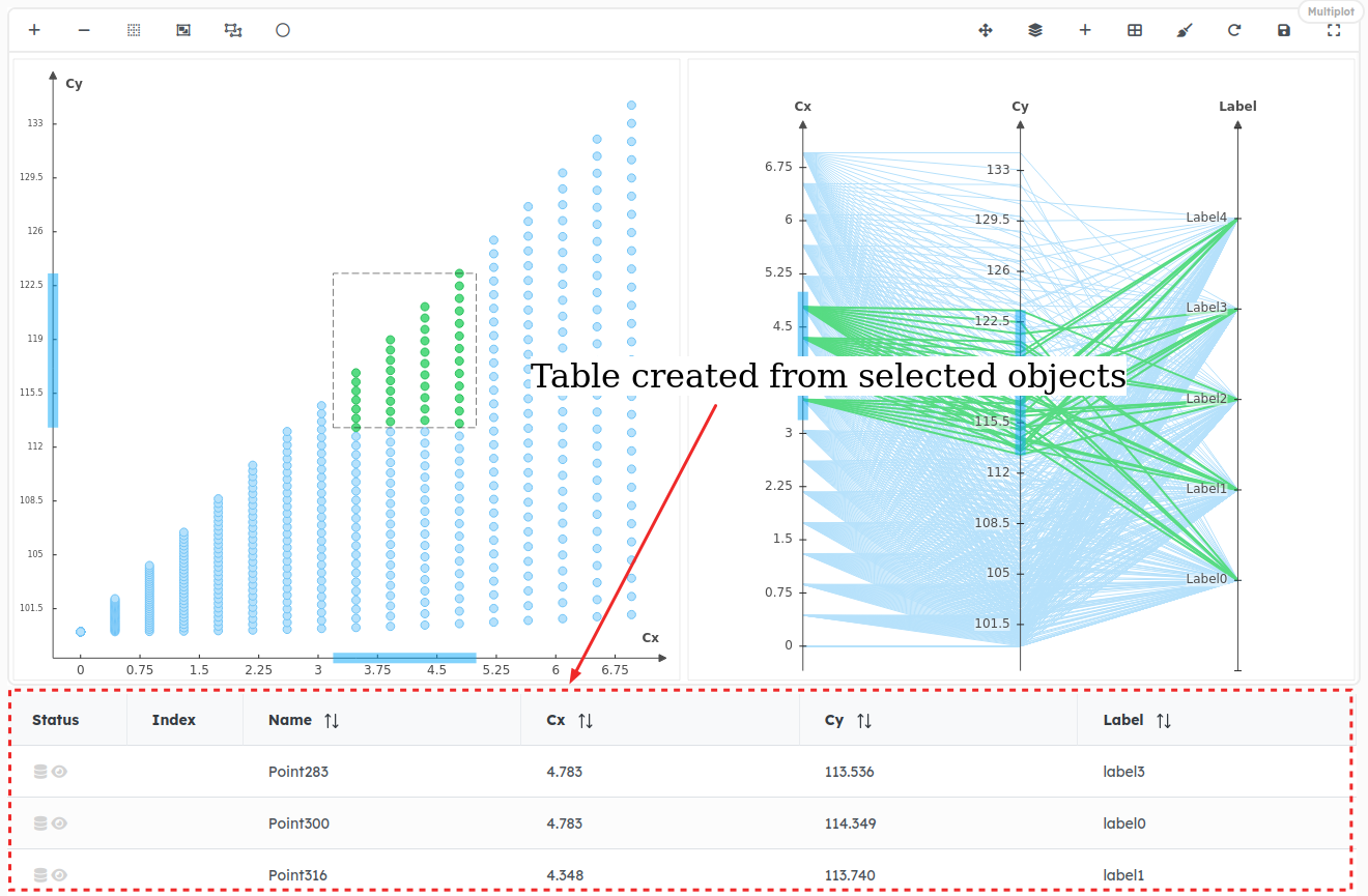
When drawing multiple objects on one figure, one feature of interest can be to select these objects on the plot and to get them downloaded from the database and displayed on a table below the figure.
The DessiaObject Dataset implements it by default by adding an attribute reference_path to each displayed element in the object container:
# self is an object container where objects are stored in the attribute "dessia_objects"
def _object_to_sample(self, dessia_object: DessiaObject, row: int, reference_path: str = '#'):
   sample_values = {attr: self.matrix[row][col] for col, attr in enumerate(self.common_attributes)}
   reference_path = f"{reference_path}/dessia_objects/{row}"
   name = dessia_object.name if dessia_object.name else f"Sample {row}"
   return pld.Sample(values=sample_values, reference_path=reference_path, name=name)

# The vector of elements (or Samples) is built with an additional key attribute:
# reference_path, which is '#/dessia_objects/i' where # is the path of the Dataset
# and i is the DessiaObject index.
def _to_samples(self, reference_path: str = '#'):
    return [self._object_to_sample(dessia_object=dessia_object, row=row, reference_path=reference_path)
            for row, dessia_object in enumerate(self.dessia_objects)]

# The Scatter draws the previously built samples
@plot_data_view("Scatter", load_by_default=True)
def scatter(self, reference_path: str = "#"):
		samples = self._to_samples(reference_path)
		return pld.Scatter(elements=samples, x_variable="period", y_variable="speed")
From the platform view, selecting referenced objects (i.e. with a specified reference_path) on a plot will make a table appearing below the figure (warning: data are not from the pendulum example):
To select several objects on a figure, several features are available:
- Ctrl + click: Press
Ctrland click on several points.
WARNING: Points selected this way can not be added to a Point Set (see below)
- Selection box: Press
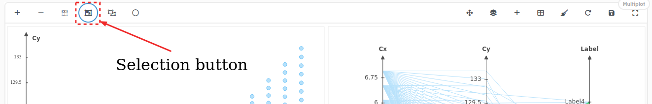
Shiftand draw a Selection Box by clicking and dragging mouse on a Frame plot (Scatter, Histogram) - Buttons: Click on the
Selectionbutton and draw a Selection Box by clicking and dragging mouse on a Frame plot (Scatter, Histogram)
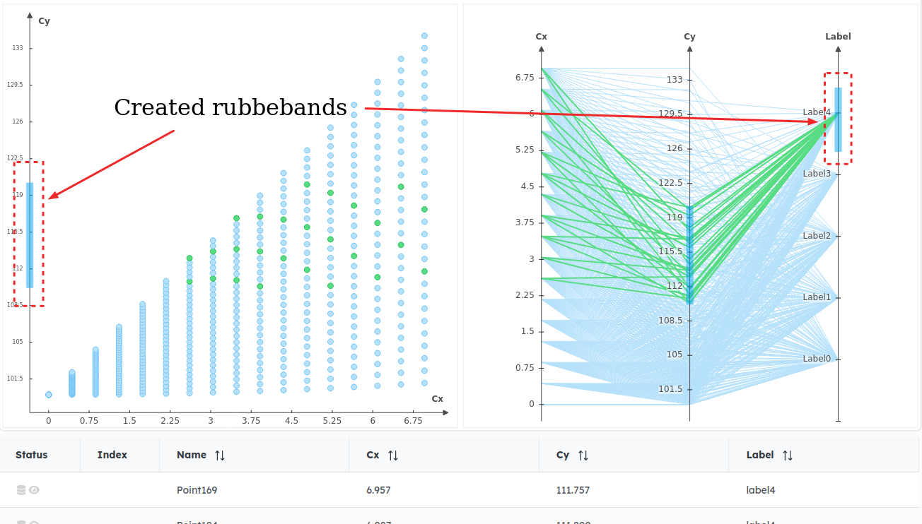
- Filters with rubberbands: Click and drag mouse on any axis of Scatter, Histogram or ParallelPlot to create a
Rubberbandthat allows to select range of values:
3.2.2 - Handle view
The view on figures can be handled by user’s manipulations. Available methods are:
- Mouse buttons: Click and drag or wheel mouse to handle the view box and the zoom level,
- Zoom box: Click on the
Zoom Windowbutton to activate the Zoom window tool to define new minimums and maximums on displayed axes of Frame figures (Draw, Scatter, Histogram) thanks to a Zoom window that is drawn with mouse click and drag,
-
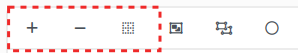
Buttons (vertical / horizontal, merge points):
- Merge points on Scatter with
Merge Pointsbutton: Activate this option for performances when drawing a Scatter plot. It will merge some points to down scale the number of drawn points, for performance reasons,
- Merge points on Scatter with
- Switch from Vertical axes to Horizontal axes on Parallel Plots: Click on
Change dispositionbutton to switch from vertical to horizontal layout (and inverse) on parallel plots
3.2.3 - Add figures on Multiplot
The Multiplot figure allows to dynamically add new Scatters or Parallel Plots on the existing view. WARNING: The added figures on Multiplot are not persistent. This means they won’t remain after a refresh or after leaving the current page.
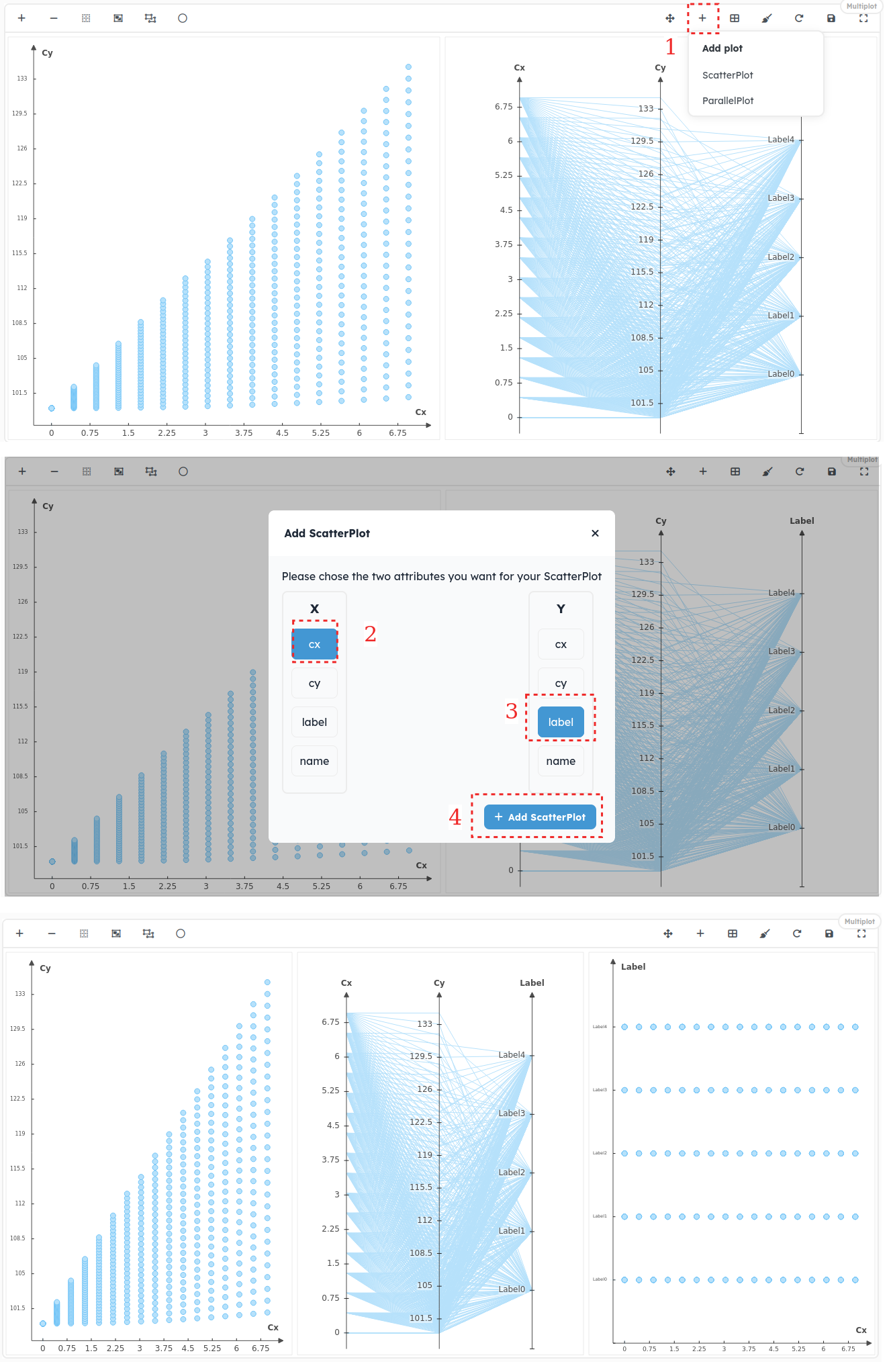
3.2.4 - Change Multiplot Layout
The Multiplot figure allows to dynamically change figures layout on the existing view. WARNING: The custom layout of Multiplot is not persistent. This means it won’t remain after a refresh or after leaving the current page.
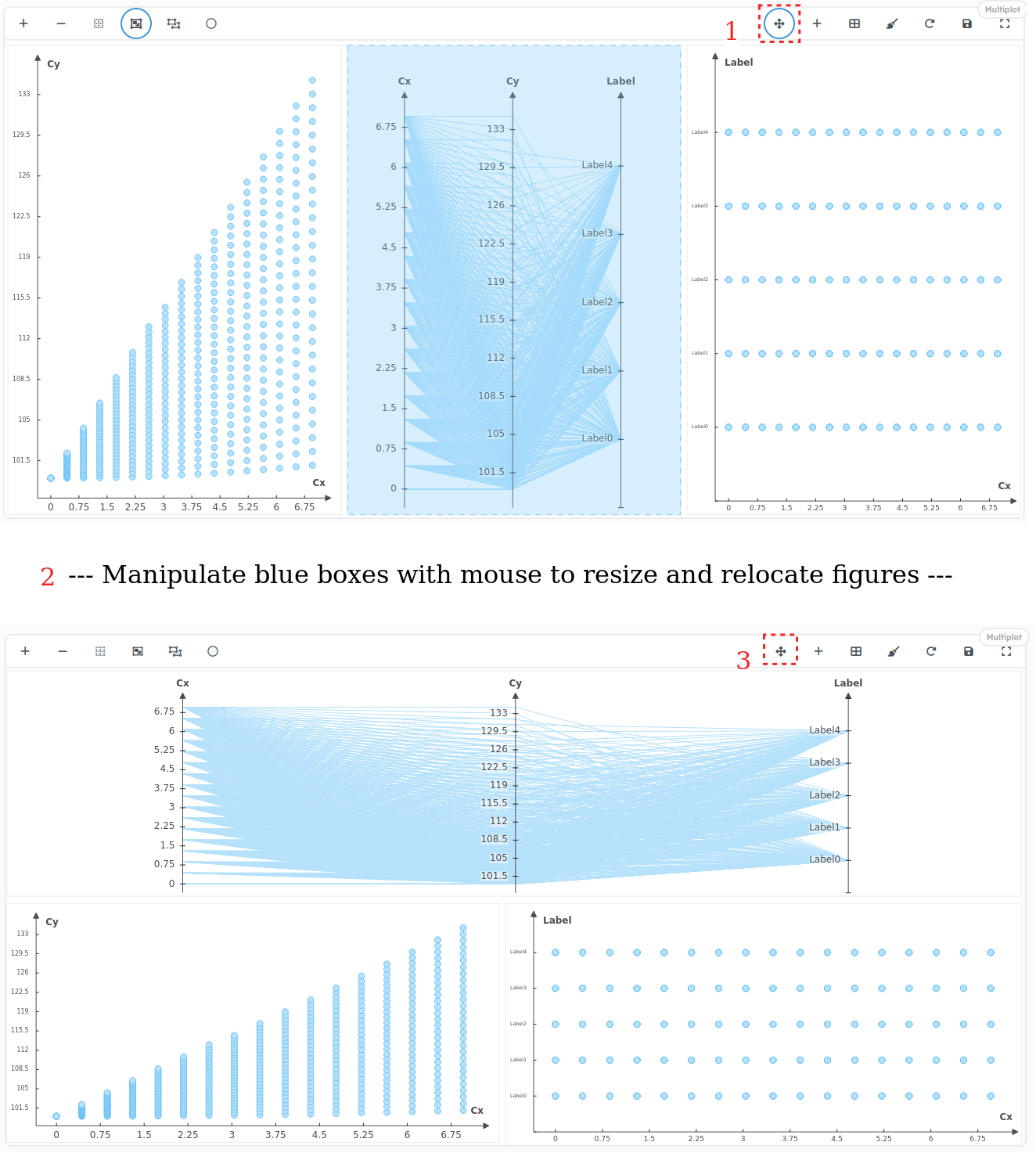
To cancel changes on the Multiplot layout, click on the Order Plots button
![]()
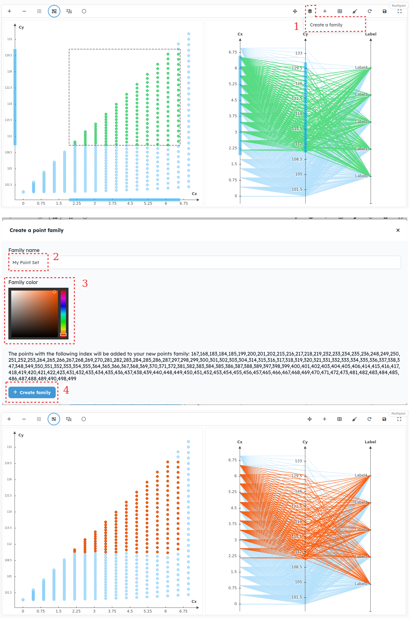
3.2.5 - Create Points Sets
PlotData allows to dynamically add points to subsets for giving them a new color to get a better view of clusters in figures. To do it, select some points with the selection tools detailed before and add them to a PointFamily
WARNING: The custom points sets are not persistent. This means they won’t remain after a refresh or after leaving the current page.